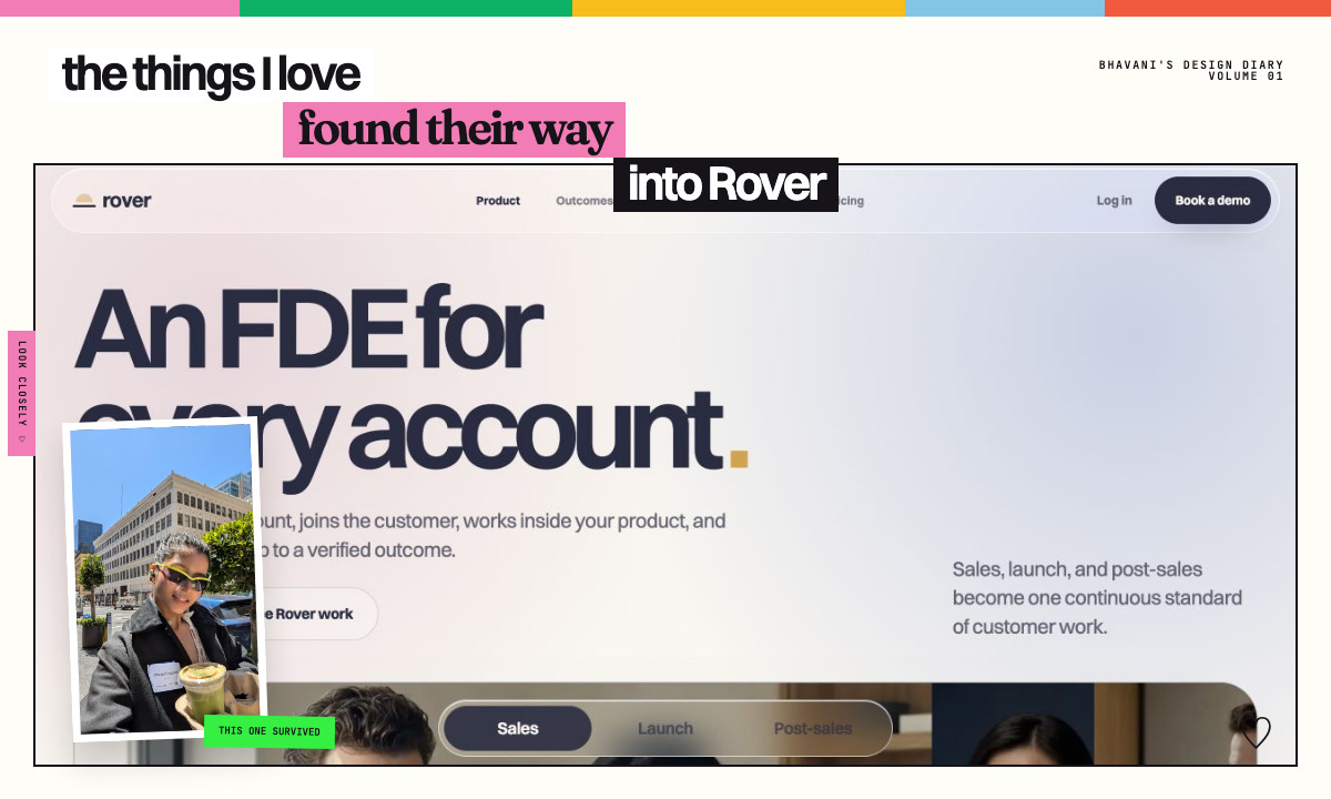
I love beauty. I look for it constantly.
I notice the exact pink of a shoe, the weight of a gold watch, the way a feathered jacket moves, the light on a plaster wall, and the one funny title card in a quiet video. I save architecture, movement, clothes, art, and tiny details that make me giddy. I care whether pink feels like shell, ballet slipper, lipstick, or birthday cake. They are not the same pink.
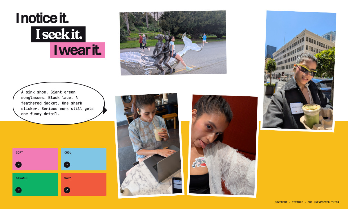
This is also how I dress and how I move through a day. One day it is pale pink Onitsuka-style sneakers. Another day it is a white, kimono-like feathered jacket over a black top, jewelry, and a shark sticker that makes the whole thing less expected. Sometimes it is giant lime-edged sunglasses on a San Francisco street. Sometimes it is a blue floral layer, coffee, and my laptop. I can be climbing onto a public whale sculpture one hour and working from a cafe the next. The little bit of play is not separate from the serious work.
I once paused a David Senra video because I noticed the tiny watch Lulu Meservey was wearing. I took a screenshot, sent it through Google Lens, and found the Rosefield Mini Oval Gold. That tiny search is very me. I see something beautiful, I want to understand it, and then it becomes part of the visual library in my head.
For a long time, I did not think this had anything to do with building a serious B2B product. Revamping Rover made me realize it had everything to do with it.
I was already designing Rover before I opened the editor
The website had to carry the same point of view as the person making it.
That did not mean turning Rover into a fashion site. It meant bringing the habits behind fashion and interiors into software: proportion, silhouette, texture, contrast, repetition, one surprising color, and the confidence to remove something beautiful when it does not belong.
My references were not other SaaS homepages. I kept returning to the symmetry, material scale, and quiet confidence of RH sourcebooks. Their copy was not my reference. Their sense of proportion was. The eye can settle because the composition is balanced. Wood looks like wood. Light feels like a material. A single object is allowed to carry weight. Architecture taught me proportion. Art and public sculpture taught me movement and nerve.
I combined that calm with the visual grammar I loved in creator videos, especially the frames I had saved from Breanna Quan. Romantic italic titles. Tiny mono notes. A cream message bubble. A kaomoji. Bunny ears over a number. Three little strikes beside a croissant, as if someone had just taken a bite. Cute made from smallness and precision.
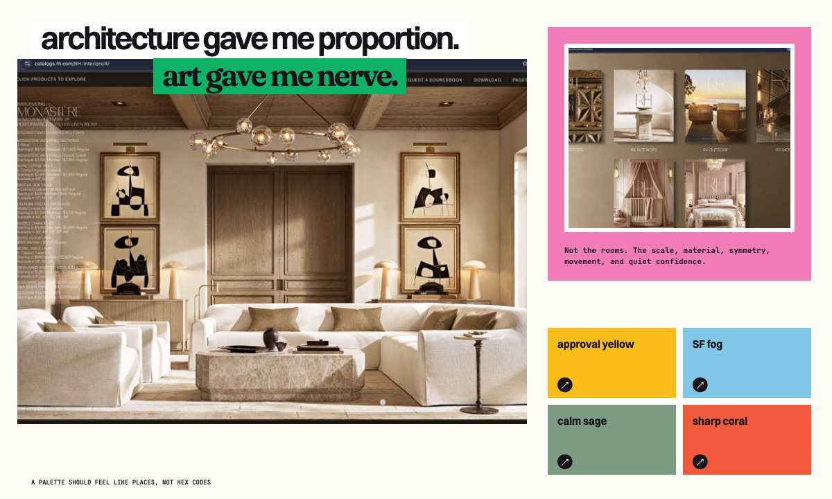
The result was First Light: alabaster, shell blush, periwinkle, ink plum, controlled gold, and one sharper note when the page needed energy.
AI made everything possible and nothing decided
I rebuilt Rover across many sessions with Codex and Claude. The models could make another homepage, animation, character, card, or complete new direction almost immediately.
That abundance was useful, but it was also the problem. AI said yes to every idea with the same enthusiasm. More glass? Yes. More motion? Yes. A mascot? Here are five.
My feedback started as irritation.
Janky. Cramped. Kiddish. Forced. Whitewashed. Vibe-coded. Why is that dot there? Why is the main promise hiding? Why is this moving when nothing changed?
Eventually I stopped asking AI for one more palette and started rating what it gave me. Pretty beige got two out of five: polished, no pulse. Lavender glass got three: beautiful, too expected. First Light got five because it was calm enough to trust and strange enough to remember. The accidental green also got five, not because it belonged everywhere, but because it made me feel something immediately.
Four recommendations. Only two made me feel anything.
Polished. Expensive. No pulse. AI reaches for this when it wants to look premium without making a decision.
BHAVANI'S NOTES ↗Beautiful, but too expected. I kept the softness and removed the “AI made a glass orb” feeling.
BHAVANI'S NOTES ↗Shell, sky, ink, and a controlled glint. Calm enough to trust. Strange enough to remember.
BHAVANI'S NOTES ↗It was meant to disappear. It made me giddy, so it earned a small, sharp role in the system.
BHAVANI'S NOTES ↗The work became better when I stopped treating irritation as an opinion and translated it into a rule.
One direction made Rover a living glass drop that moved through capsule, lens, loupe, and seal states. It was detailed and charming. Inside another company’s product, it could feel like a toy or a speck of dirt.
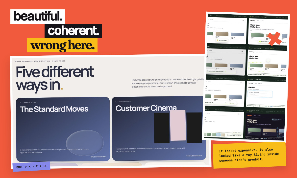
That rejection gave me a better rule: Rover can feel alive, but every gesture has to explain something.
The accidental color I could not throw away
The sticker sheet began as a production artifact. I asked for a perfectly flat green background so the envelope, croissants, Solari tile, glass pebble, bow, and sparkles could be cut out cleanly.
Then I saw the full sheet.
The electric green was supposed to disappear. Instead, it made the flowers, pastry, glass, hardware, and ivory bow feel even more surprising. It was loud, a little accidental, and completely delightful.
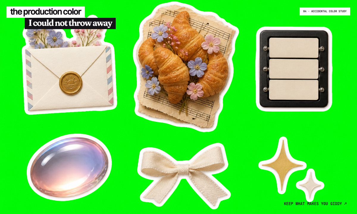
That moment describes the best part of working with AI. You can ask for a practical intermediate asset and discover an idea you never would have briefed. Taste is recognizing the accident worth keeping. The green did not become Rover's whole palette. It became the sharp note that stopped the softer colors from feeling too polite.
What actually worked in the browser
AI was not good at orchestrating a large collection of elaborate animations. Too many moving parts created timing problems, responsive problems, brittle loops, and visual noise. Asking for more 3D did not make the story more alive.
The better answer was to give each medium one job.
SVG handled crisp diagrams and stable geometry. Rive handled finite states and one meaningful gesture when a state changed. CSS handled tiny ambient moments that could stop cleanly. AI video handled one directed human scene, not a parade of effects.
SVG draws. Rive changes state. CSS celebrates. Video carries the human scene.


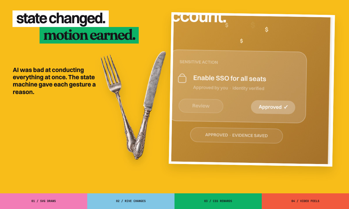
The state machine was the breakthrough. Rover could move from waiting to approved to evidence saved. A few dollar signs could float upward when value was unlocked. A subtle heart could mark a human win. The movement did not decorate the state. It confirmed that something had happened.
Design can reach more than the eye
I kept returning to Solari split-flap boards because they are sensorial even when they are still. You remember the clack before you remember the typography.
At first, AI copied the surface and made letters flip everywhere. That was noise. I wanted the job the reference was doing: one state leaves, another arrives, and the change has physical weight.
For Rover, that became Scope, Approval, and Evidence. Rover shows where it can act, waits when judgment belongs to a person, and leaves proof when the work is complete.
One state leaves. Another arrives. Sound can reward the change, but silence stays the default.
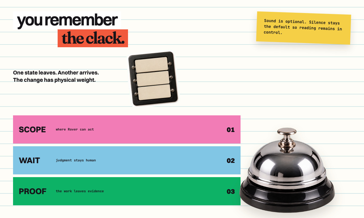
This taught me to ask three questions about motion: What changed? Who needs to notice? Which sense should carry the message? Sometimes the answer is animation. Sometimes it is sound. Sometimes it is simply giving a static state enough contrast and space to be understood.
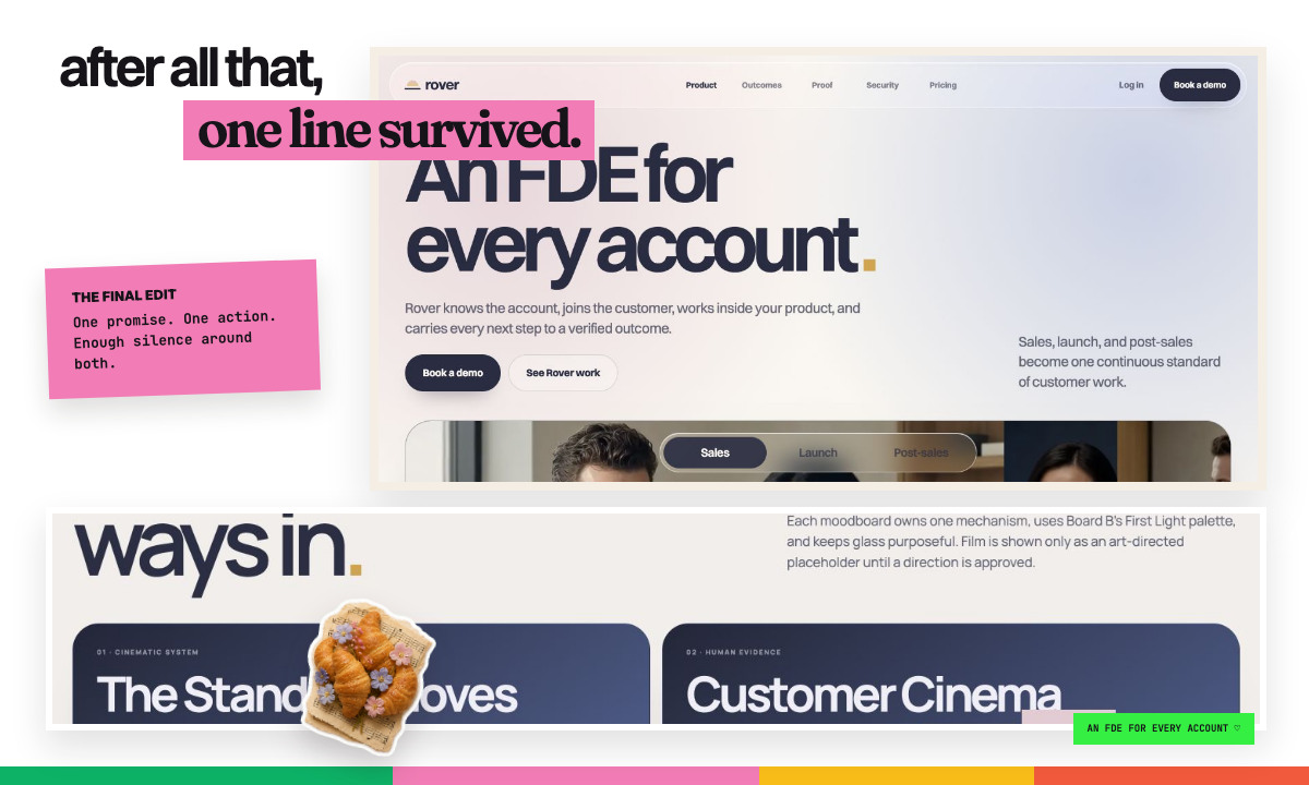
After all that, one line survived
The last version of Rover became quieter as my point of view became clearer. Under it were dozens of directions, screenshots, rejected glass objects, film ideas, interaction studies, and sentences I once thought were essential. The final page did not need to display all that labor. It needed to make one line impossible to miss.
Even the final CTA was a design problem. The word count, rhythm, surrounding space, and number of actions all mattered. Too many words weakened the ending. Two competing buttons made the page hesitate.
What I learned is simple:
- AI expands the options. Taste reduces them. Both are necessary.
- Name what a reference is doing. Copy the balance, rhythm, material, or consequence, not the whole surface.
- Choose the medium by the job. SVG, Rive, CSS, video, and sound each solve different problems.
- Motion belongs to a state change. If nothing changed, the object probably should not move.
- Put taste into the system. A conversation can create a direction. Files, components, and tests protect it.
I did not get the Rover website by discovering a magical prompt. I got there by paying attention to what I already loved: clothes, architecture, public art, travel films, mechanical boards, color studies, flowers, tiny watches, little jokes, and a very good croissant.
The product finally felt like mine because I let all of those things into the work.